monitor custom color calibrating for prints
I recently ordered a Spyder monitor calibration tool to custom calibrate my monitors, and this post isn’t to knock it at all. It was actually really cool to watch it work, but it just didn’t do what I needed. I wanted to match my computer monitors more accurately to my prints to ensure what I’m delivering to my client is consistent with the colors on the prints they’re receiving. Since I’ve recently switched back to my desktop, I just wanted to make sure it was right!
When I ran the software, it did calibrate the colors on my screen, and it made the overall appearance much warmer. But when holding my test prints up to it, it just wasn’t matching the way I had hoped. My choices were either to stick with the Spyder results and completely change my editing, talk about falling into an editing crisis. No thanks. Or, custom calibrate my colors. I did some research, being the computer nerd that I am, and decided it was best to just custom calibrate my screen. The bonus to that, it’s free!
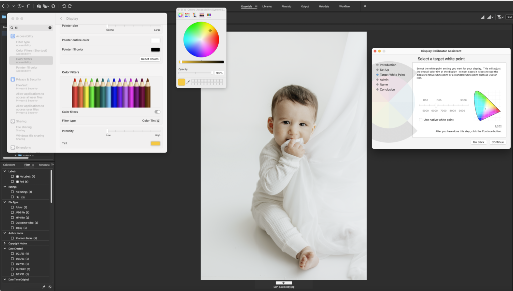
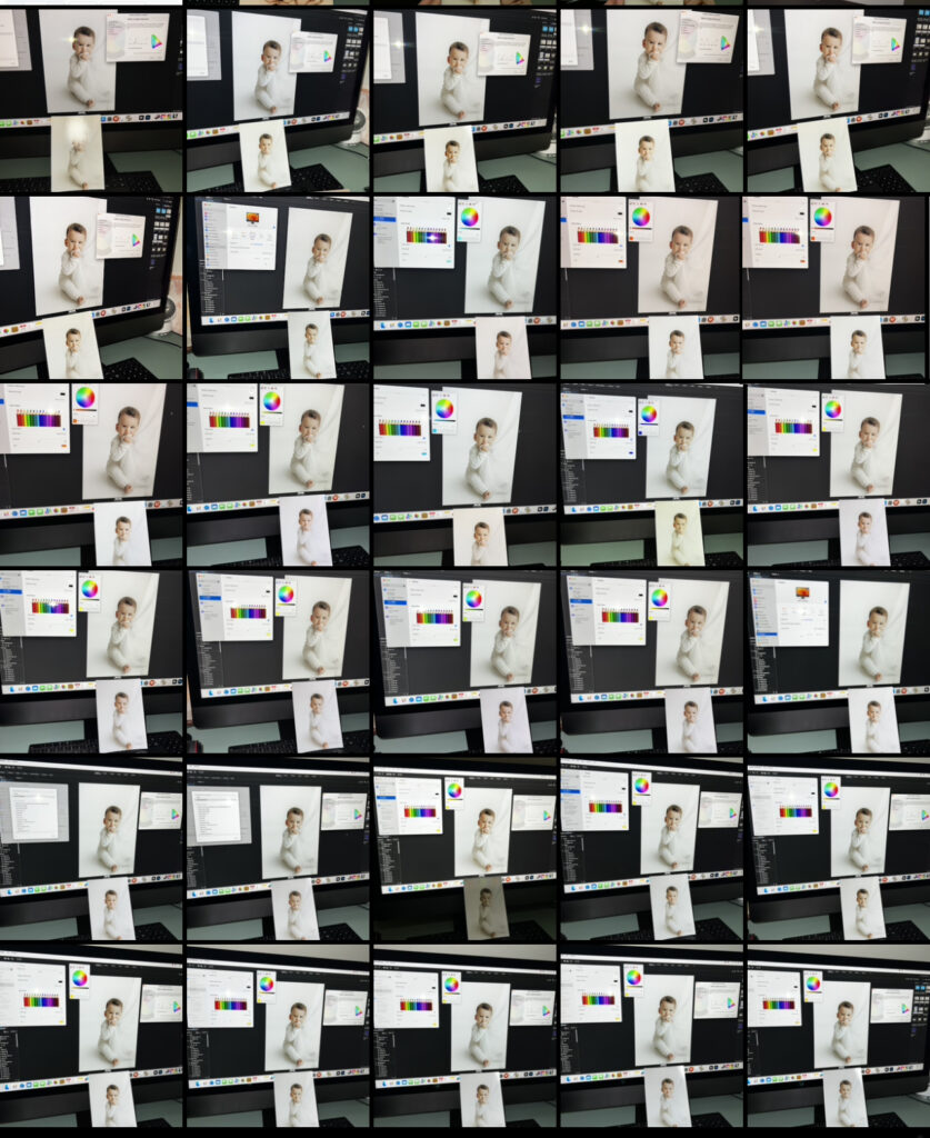
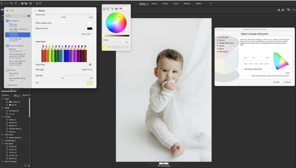
Before you being either process make sure to order prints with exactly how your settings are, you want to see what colors you actually need to tweak. To start the custom calibrating I went into my computers display settings and created a custom profile to adjust my white balance on the screen. You can use this article to help you get started, but then make sure you come back here because that won’t solve all of your color problems! Now that you have the display calibrator assistant open, go back into your settings and open the color filter screen, if you don’t know how to do that, use this article!
With both boxes open, place your image in the middle and put your test print near your monitor where you can easily compare what’s on your screen to what is on the print. Now, look at both images and start making adjustments. I started with my white point and selected a point where I thought was close to the WB in the print, then looked for underlying colors and kept tweaking the color filter until it was pretty spot on. There’s also an area where you can increase the contrast, which was really helpful for my MacBook Pro.
The whole process took MAYBE ten minutes, I promise it’s not long at all. I made sure to take a lot of shots along the way so I could see exactly what needed to still be adjusted.
Just remember, you’re not tweaking the computer to what you want the image to look like, you’re tweaking it to match the print. THEN, when you edit after that, you can tweak the actual image colors because you know when it’s printed it will be correct! As you can see in the image collage, you can see exactly how they weren’t matching to each other until the very end.
This can also be done with HP computers, I just don’t remember exactly how, but I have done it in the past prior to switching to Macs. This article may be able to help all the hp’ers out there though!